


New We Get Around Network Logo: Which one do you like?14829
 WGAN Forum WGAN ForumFounder and Advisor Atlanta, Georgia |
DanSmigrod private msg quote post Address this user | |
Quote:Originally Posted by @jpierce360 @jpierce360 Can you tell me why you like #2 versus #1? Dan |
||
| Post 26 • IP flag post | ||
|
WGAN Forum Founder and Advisor Atlanta, Georgia |
DanSmigrod private msg quote post Address this user | |
Quote:Originally Posted by @TakedaSan @TakedaSan Thanks SO much! That's awesome! Now you will make it even harder to decide! (A good problem.) Dan |
||
| Post 27 • IP flag post | ||
|
WGAN Forum Founder and Advisor Atlanta, Georgia |
DanSmigrod private msg quote post Address this user | |
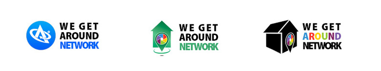
| Hi All, I am torn between which Kimp designed logo. I was hoping for a clear winner. Others that want to weigh-in? Best, Dan |
||
| Post 28 • IP flag post | ||

|
TakedaSan private msg quote post Address this user | |
| @DanSmigrod, You help us a lot with the forum content. It was a form of gratitude. Now I will leave the decision to you and the forum members. I don't want to complicate things further. Kkkkk Takeda |
||
| Post 29 • IP flag post | ||

Frisco, Texas |
Metroplex360 private msg quote post Address this user | |
| I like the old one better. It's cleaner and one thing we know about logos is that modern logo design doesn't use gradients and keeps it very basic when it comes to color choices. The old logo has symbolism that matches the concept of getting around whereas the new one has a shed |
||
| Post 30 • IP flag post | ||
|
WGAN Forum Founder and Advisor Atlanta, Georgia |
DanSmigrod private msg quote post Address this user | |
Quote:Originally Posted by @Metroplex360 Is there a technical reason not to use a gradient? Dan |
||
| Post 31 • IP flag post | ||
|
|
TakedaSan private msg quote post Address this user | |
| Well @DanSmigrod, I must agree with Metroplex. I also like the old one. About color, the use of flat color it's a modern trend design. But you can use gradients on logo if you want, and use it on digital and some print assets, but anyway you must have a flat color logo design so you can use on some specific impressions because of costs, like embroidering on a T-shirt, for example. |
||
| Post 32 • IP flag post | ||
|
Frisco, Texas |
Metroplex360 private msg quote post Address this user | |
| Gradients are kind of old-fashioned. You're not going to find them used these days | ||
| Post 33 • IP flag post | ||
|
|
dave3d private msg quote post Address this user | |
| Yep Dan, I'd be using the old one as well |
||
| Post 34 • IP flag post | ||
 WGAN Standard WGAN StandardMember Las Vegas |
VTLV private msg quote post Address this user | |
| I’m on team OG. Stick with what ya got and spend tour time on other projects. Since that didn’t sound like an option at the beginning, I picked then lesser of 2. First choice is clean and represents everything I see as WGA | ||
| Post 35 • IP flag post | ||

|
rko1 private msg quote post Address this user | |
| I have to agree, change is not always what is needed. If the change is drastic, then users have to get used to recognizing the newer logo, when you already have an ever growing base that is already familiar with the current one. If you want to change, I prefer the first one from Takeda. Scanning is now much more that just a house, just look at the ever growing diversity of scanned properties from all the users. WGAN is about the growth and changes in the industry, it is about the idea of scanning (3D, 360, VR), and creating new worlds (a 3D Vista) in our world. That is what WGAN stands for not what is today but what we can imagine for tomorrow. And what GREAT ideas your users have. bold text | ||
| Post 36 • IP flag post | ||
This topic is archived. Start new topic?